 Matt Ruta
Mountain Weather Forecasting

A few people have asked me about my method for chasing weather windows in the mountains. I guess they figured that they’d receive a quick answer, but each time I ended up replying with either a novel or a TED talk. Depending on whether they’d been foolish enough to ask in person. Since it’s on my mind, I thought maybe I’d better just write something down.
Forecasting complex weather systems in the mountains is an art as well as a science. I’m not going to pretend that my methods are any better than anyone else’s, or even that they’re good. But they have seemed to work pretty well for me. At the very least, they’ve provided a better success rate than basic forecasting apps/websites, even ones that claim to have tweaked their algorithms for mountain weather. Hopefully, you can take something away to add to your own toolbox.

I’ll start with a quick overview of the resources I use most:
- Avalanche Canada’s Mountain Weather Forecast
- An easily digestible, mountain focused report on incoming weather for western Canada. Written by experts, interpreted for recreationalists. If you’re going to use a post processed weather forecast, make it this one.
- SpotWx.com
- Web based graphical spot forecasting for any location. Displays raw (no interpretation applied) data from several models. A bit clunky to use, but totally free and very powerful.
- Flowx
- Android based visual spot forecasting for any location. Like SpotWx, it displays raw (no interpretation applied) data from multiple models. Very well designed, and has models that SpotWx doesn’t for a small fee. My go-to forecasting platform.
- Windy.com
- A very different web based, visual forecasting tool. Useful for visualizing conditions across a wide area (i.e. for storm dodging or chasing), and one of the only places providing free access to data from the expensive and state of the art ECMWF model.
I’ve got a bit of a multi-level process. Most of the time, all I want is a general understanding of what’s going on so that I can tailor my plans to suit conditions, as well as keep an eye out for periods of particularly good or particularly bad weather.
Everyday forecasting:
My daily routine starts with a visit to avalanche.ca or the Avalanche Canada app. For a glance at the avalanche bulletins, obviously, but also for the excellent Mountain Weather Forecast. As a quick report highlighting relevant info, it’s hard to beat. Next, I scroll through my “forecast wall” – three or four home screen pages on my phone, covered in Flowx forecast widgets for different locations. See the images below.

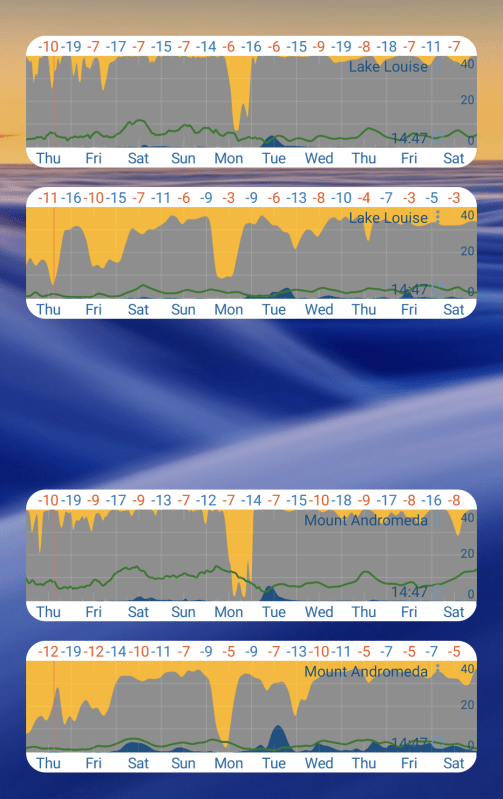
I like to put a 10 day chunk of the GFS forecast next to a 10 day GDPS for the same location, so that I can compare the two models at a glance. This is very doable in SpotWx as well, it’s just a bit clunkier. It’s worth noting that beyond a few days out, accuracy deteriorates exponentially, so it’s important to keep checking back.
At this point, I already have my general sense of what to expect in the next few days to a week, depending on the stability of the pattern at that time. If all I’m doing is skiing powder or trail running, this might be as far as I go.
Identifying and tracking windows:
When I want to dig deeper, the comparison that I mentioned is the key to improved accuracy. Models don’t always agree with each other, but the more agreement I see, the more confident I am that the forecast is going to hold up. When I spy a window or series of events that looks favourable on my forecast wall, I start to watch the two graphs as the updates roll in. If I see some agreement, or at least convergence, I open up the Flowx forecast for that particular area and dig in further.
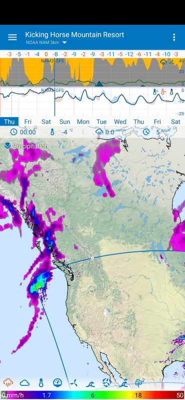
Inside of five days, the ICON Global becomes available, giving me a third medium range model to compare with. The GFS, GDPS and ICON are all independent models from separate institutions, so they check each other well. Next, the NAM12, followed by the short range, high resolution models like the NAM3, HRDPS, RAP and HRRR.
That’s a lot of acronyms. And a lot of data, some of which can be total junk. As the window I’m tracking moves into the range of these various high resolution forecast models, I start to watch weather stations and webcams near my objective(s). Think local ski area websites, Parks Canada weather stations and DriveBC. Windy also has webcams right on their map. The idea is to compare real world observations with what was predicted to see which models seem to be getting it right and toss out the ones that appear to be getting it wrong. Or at least reduce their weighting in my mental forecast.
Over time, I’ve developed heuristics to help identify which models I expect to be accurate in which situations, as well as where certain models’ biases lie. For example, if I expect upslope storms, I often weight the ICON higher then the GFS or GDPS, as for whatever reason it seems more willing to expect a storm to move from east to west.
The shortcuts are both an advantage and a liability. They save time and energy but present a perfect opportunity to ignore information that I don’t like. I try to use the various models to check each other, looking out for outliers and hopefully my own biases. Inevitably though, the latter creep in. Aspirational forecasting has been the downfall of many an ill fated mission, but I seem to be getting better at catching myself as I gain experience.


Dialing it in:
In the 24-18 hours before go time on a big objective, I shift my focus a bit. As long as my window still seems to exist, I want to try to pin down things like freezing levels, cloud cover at various elevations, squalls and other details. By the time I’m looking at the short range, high resolution forecasts I probably already know I’m going. I may be trying to choose between multiple objectives, agonizing over the quality of the freeze, assessing specific hazards like solar or wind, or trying to decide what time to start. I take note of certain markers like changes in wind speed or direction preceding changes to cloud cover or temperature. I’ll use these to update my mental forecast throughout the day.
Then I go, and hope I got it right.
The TLDR here is: pick out some models, compare them and look for agreement. The more agreement the better. Once you know what to look for, you’ll start spotting patterns. As you match those patterns to real world experience, you’ll start to see combinations of events that lead to great skiing (or climbing or flying or whatever). Then you can drill down into increasingly precise models to build your own forecast for your objective during a specific window.
So, where should the average mountain traveller begin?
A good place to start is by opening up SpotWx.com or Flowx, picking your location and comparing the various models to what you actually observe outside. Here in the Canadian Rockies/Columbias, I’d start with the GFS and GDPS, then start checking out the shorter range models. See when they agree and when they’re each accurate/inaccurate, and read the AvCan weather forecast to get a feel for what the data means in layman’s terms.
The further you go down the rabbit hole, the more accurate your personal forecast can be, but just comparing a couple of models and reading the forecaster’s report will get you ahead of the vast majority of folks out there. It may also save you from a skunking, or find you a window that the hordes have missed.
